How many websites do you visit every week? Or—if you’re an internet addict like yours truly—every day?
You may think you know a lot about websites and maybe you are pretty good at distinguishing a well-designed site from a fly-by-night operation. But how much do you really know about the decisions that went into creating those websites? How did they choose their colors and font? How did they decide what types of pages to include? What kind of coffee did they drink while programming?
Well, allow me to let you in on a little secret: Those decisions are not accidents; they’re not random; and home-roasted Kenyan.
Part 2 of 5: This post is part two in our series, “Web Design 101.” Our goal for this blog is to inform, give our opinions, and incite healthy discussion on web design and internet marketing (kinda our specialty).
Our last post covered the types of webpages that may or may not be included within a website, depending on the type of business. In this post, we’re taking a closer look at the website design layout of your site and how it can affect how you are viewed by potential customers.
Defining “Layout”
Now, let me clarify what I mean when I talk about a site’s “layout.”
You may have come across websites in the past (at least, we hope they were in the past) that were so disjointed, cluttered, and confusing that you didn’t know where to go in order to find the information you were looking for. Or you found yourself lost deep in an online maze that made Wonderland look like a card catalog. Maybe everything was upfront and easy to find, but just didn’t look professional.
Websites like this are, sadly, a dime a dozen (and look like they cost that much to build). But taking your user into consideration is one of the things that separates the professionals from the college kids working out of their parent’s basement. We’ve identified the top three characteristics of developing a cohesive, appealing website layout. How does your website stack up?
1. Clarity

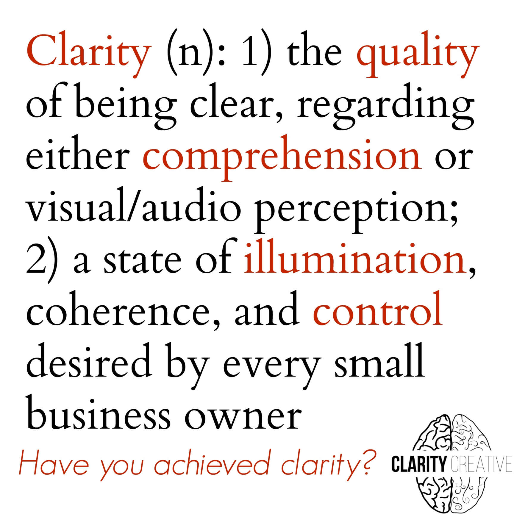
This should come as no surprise coming from a company named “Clarity Creative Group,” but clarity is one of the most important aspects of web design.
“Clarity,” simply put, refers to how well your reader or client can process the information on your site. Is the site or page easy on the eyes or is there too much unnecessary information? We’ve seen so many “designers” succumb to the temptation of filling their pages with as many images as possible, stuffing in information until you’re just not sure where to look.
Think of the TV show “Hoarders.” These houses are so far gone that you can’t get from one room to another without climbing over a mountain of Flowbees. Even if everything in the house is brand-new, the neighbors still don’t want to visit.
You want to create clarity by keeping your “decorations” simple so they won’t detract from the main focus: you!
- Keep the text on your webpages short and simple. Shorten your paragraphs. Use numbered lists and bullet points to visually break up the page.
- Include only those photos that directly relate to your subject matter. (If the page is a gallery page with a lot of photos, consider displaying them in a slideshow-type format that prevents the eye from roaming all over the page.)
- Stick with one design “motif” throughout your website. Changing themes, colors, or even fonts from one page to the next is jarring for the reader and creates a very disjointed impression.
2. Organization
Okay, you’ve removed all the clutter, and rescued the cat from being suffocated beneath a pile of Snuggies (figuratively speaking). Next, you need to organize all of that information so that people can easily find what they need.
The primary focus of organizing your website is your menu. Obviously, your menu bar will be located on your homepage (ideally at the top of the page, so visitors won’t have to scroll down to find it), but it should also feature on every other page as well. This way, site visitors won’t have to backtrack their way to the homepage if they decide to explore the rest of your site (and they should always be encouraged to keep exploring).
Additionally, the menu needs to be organized so that people can easily find the information they need. In our previous post, we discussed the types of pages you might include depending on the purpose of your business. Your menu should properly organize these pages under appropriate headings and categories.
A general contractor might have separate pages for “Kitchen Renovation,” “Exterior Painting,” “Carpet Installation,” and “Drywall Repair,” but would categorize these pages under one “Services” heading. Any site visitor looking for a kitchen redo would know to search for the appropriate drop-down under the “Services” tab and not the “About Me” section.
3. Interactivity
Lastly, you want to make sure your customers and followers are able to interact with you and your site.
“Interactives” engage your viewer and entice them to dig deeper, sign up for your service, purchase your product, or hire you. The following items are some of the best ways of creating a virtual “conversation” between you and your viewers:
- SEARCH BAR: Include a way for your visitors to search for any information that may not be obvious. (There’s only so much that your menu bar can do.)
- INTERPAGE LINKS: Interpage links act like Hansel and Gretel’s breadcrumbs, drawing your readers through your site in a logical and sequential order. Since readers are going to be reading through your site, sprinkle in links to your other pages here and there. Guide them through your site.
- CALLS TO ACTION: Oh man, are these huge. And often forgotten. Calls to action create a clear expectation of what you want from your prospective client. Do you want them to buy something? Tell them to “Add to Cart.” Are you trying to create an online following? “Like us on Facebook!” Sure, your viewers will probably be able to grasp what it is you want from them, but including a call to action makes them that much more likely to actually do it.
- CONTACT PAGE: Make sure you include a way for customers and readers to contact you. Contact = valuable feedback and possible income. Make sure your blog has a comment section. Include a contact form on your website for potential customers to ask questions and satisfied customers to express their thanks. In an increasingly digital world, customer service can mean the difference between someone using your service or going somewhere else.
Above all, you need to make sure you have a focused goal for your website and use your layout as a step toward that goal.
Luckily, keeping your customers interested, engaged, and satisfied can go a long way toward accomplishing everything you have in mind for your company.
What types of things did you have in mind when designing your website? Let us know in the comment section! We love to hear from you!
Next up: Web Design 101: Design
Other articles in this series:
Web Design 101: The Building Blocks
Web Design 101: Content & Language
Web Design 101: Domain Name
Clarity Creative Group is a web design & internet marketing company located in beautiful Orlando, Florida. We have six pages on our website, and the menu bar is at the top of every single one.
Save


