How many websites do you visit every week? Or—if you’re an internet addict like yours truly—every day?
You may think you know a lot about websites and maybe you are pretty good at distinguishing a well-designed site from a fly-by-night operation. But how much do you really know about the decisions that went into creating those websites? How did they choose their colors and font? How did they decide what types of pages to include? What kind of coffee did they drink while programming?
Well, allow me to let you in on a little secret: Those decisions are not accidents; they’re not random; and home-roasted Kenyan.
Part 3 of 5: As we continue in our series, “Web Design 101,” we get to what most people consider the most exciting part of designing a website: designing!
Clients (or the designers themselves) often have their own “vision” for a project. Like the bride-to-be who’s finally getting a chance to execute the wedding they’ve been dreaming up since they were twelve, they’ve selected the colors, the motif, and where everything should go.
But experienced web designers understand that all of this needs to fit hand-in-hand with the layout, usability, and purpose of the site. Sure, it’s tempting to ask that the site be your favorite shade of blue, but if the site is advertising a new restaurant, you could be hurting your business more than you think.
Color
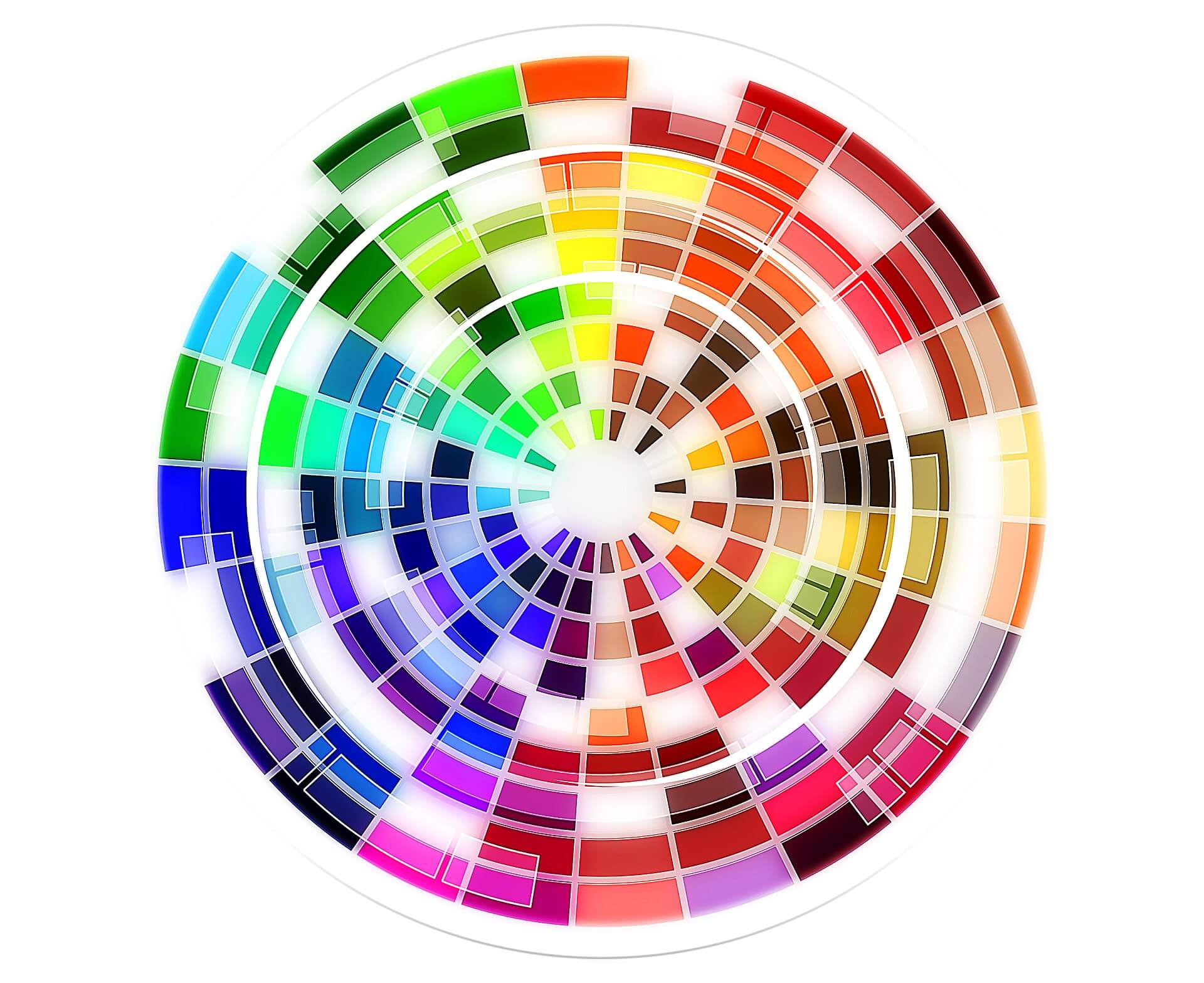
Scientists have been studying the effect of color on human emotions for decades, so it would be a good idea to use this information to your advantage.
In the intro, we used the example that the color blue could hurt your restaurant’s business. This is because colors in the blue/black/purple spectrum work in the human mind like an appetite suppressant (possibly because they subconsciously trigger memories of mold and spoiled food).
Blue also has the effect of keeping you awake and alert, because it simulates the daytime sky. (Now all of those hours you spend on Facebook while you should be sleeping make sense!)
Red and yellow have the opposite effect on your appetite. Think for a second about the company logos for McDonald’s, Wendy’s, KFC, Chik-fil-A, Sonic…. You’re getting hungry just thinking about it, right? Each of those companies (and many others) use red and/or yellow in their logos.
Those decisions were made purposefully, manipulating your subconscious in order to get you to spend money with them. Very sneaky. And very smart.
Even if you don’t sell food, you still want to consider the purpose of your company when choosing colors for your website. Hunter greens and chocolate browns would work a lot better for a hunting store than they would for a baby boutique.
This is because society has attached certain moods to different colors, and decades (sometimes centuries) of repetition have cemented these emotions. Purple has been associated with royalty since the Dark Ages. Knowing this, you can use it to create a luxurious feel when marketing your high-end jewelry store.
Alex Safie over at StealthBlog.net has created an awesome article and infographic on The Importance of Color Choice in Marketing that we think is a fantastic resource for color selection. Perhaps this will convince you to put a little more thought into your color choices.
Font
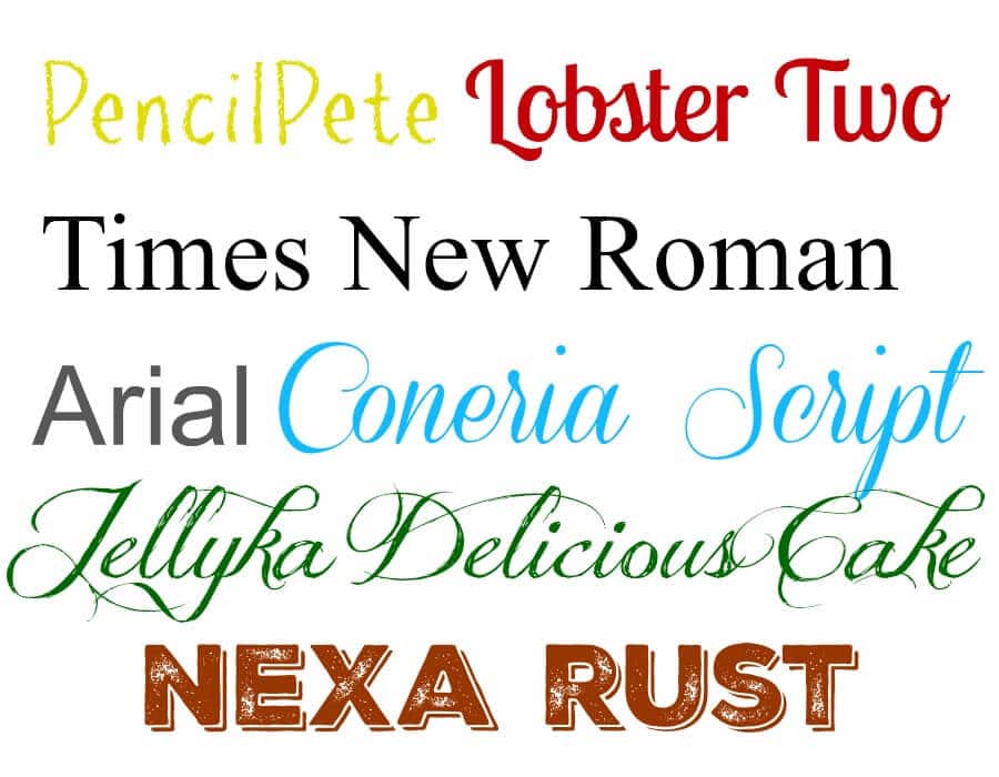
Like colors, fonts have their own connotations. A swirling script is seen as more feminine and works for things like tea rooms and jewelry stores. A stocky font that uses all capital letters is more masculine and works for the aforementioned hunting store and sports bars.
There are literally millions of fonts floating around out there, and each of them evokes a certain mood. However, novelty fonts should be used in small doses—headlines, logos, etc.—and not as the majority of your text, because they can be difficult to read.
While we’re at it, please please please, unless you enjoy knowing that people are laughing at you behind your back, STOP using fonts like Comic Sans and Papyrus! At one time they may have been cool and unique, but they’ve shown up on too many homemade birthday party invitations since then and have fallen into disrepute. Respect yourself more than that.
Motif
The motif, or theme, of a website design goes beyond color and font into the artistic realm.
One our old site, Clarity’s “motif” was a salmon-colored ribbon that showed up as our menu bar and also the dates on each of our blog posts. Other companies do birds. Or lightning bolts. But the ones that have been most successful at choosing their design motif are the ones that stopped to consider how it would relate to their business.
Color and font aren’t the only aspects of design that play into human emotions and memory. As any English Literature course can tell you, symbols are all around us, and they are almost hardwired into our brains.
Olive branches are symbols of peace. Swords remind us of war and valor. A cake is simply dessert…until you put candles on it; then it’s a birthday party!
Whether you use symbols in your design or not, consider what your reader might be thinking when viewing your website. Decide how you want to be viewed, and make sure your website carries it’s end of the bargain. What kind of colors or designs do you like to see on certain websites?
Do you prefer when a company uses a symbol or motif on it’s website or do you prefer the “utilitarian” approach? Leave your comments below!
Next up: Web Design 101: Content & Language
Other articles in this series:
Web Design 101: The Building Blocks
Web Design 101: Layout
Web Design 101: Domain Name
Clarity Creative Group is a web design & internet marketing company located in beautiful Orlando, Florida. Salmon isn’t our favorite color, but it sure looks good on our site.