Update: If you’re looking for more “How to” Picmonkey gems, check out How to make Blog Headers in Picmonkey.
Update (6/6/2017): If you have a premium account with Picmonkey, they give you an easy way to curve text using text effects. Simply highlight your text box, click on the “Effects” tab (right next to the “Options” tab on the text popup window) and select “Curve.” If you’re looking for a way to do this without upgrading to the premium version, read on.
Since I first blogged about Picmonkey’s awesome photo editing software a couple of months ago, I’ve had a little more time to play around with it and figure out some new techniques.
The one big thing that bothered me about the effects was that there was no way to get your text to match up with all of Picmonkey’s cool curved banners. I looked around on the site, I ran “how to curve text in Picmonkey” through a search engine, I right-clicked at every chance I got, but still came up with nothing.
Then, while working on our most recent New Year’s post, I figured it out.
To curve your text, you have to break it up into smaller segments.
I mean, think about it: we all learned in geometry that a circle is a shape with an infinite number of sides. The greater the number of sides, the rounder the shape. So if you break your text up into just one or two letters at a time, you can curve them into any shape.
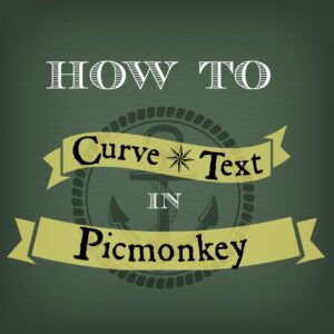
No, it’s not at all difficult to do, just a little tedious. But once you get the hang of it, you can knock ’em out in a matter of minutes. I think the image you see here took maybe 30 minutes, start to finish. And that was with me stopping every few steps to take a screen shot.
Start by getting your background ready and placing the banners you want to use. Keep in mind that if you want to add a texture to your background like I did here, you’ll have to do it before you add any text or overlays, otherwise the texture will be added to those as well.
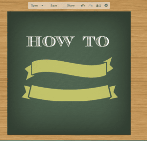
Next, decide what text will go into each banner. I went with “Curve Text” in the top banner and “Picmonkey” in the bottom one.
There are two methods for setting your curved text in place. The first method is to type and curve as you go, like this:
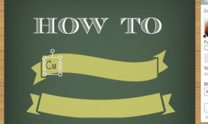
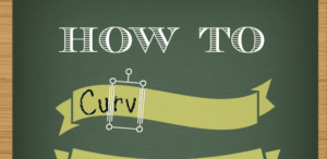
Type only a few letters into each text box. As you can see here, I’ve broken the word “curve” into three parts: cu-rv-e.
Once you’ve typed your letters into the box and shrunk it down to size, move the letters snugly against the previous ones and rotate them using the circle sticking out from the top of the text box.
When you rotate your box, imagine that there is a straight line running underneath them, and make this imaginary line parallel to the curve of the banner directly beneath. This is tricky, since we’re dealing with curves and nothing will be exactly parallel, but it’s the only way your letters will look right.
In the picture above, you can see how the letters “rv” are following the line of the banner as it slopes down to the right.
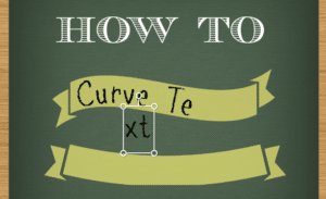
Keep going with the rest of your text.
In this instance, I decided to change to a different font (“Roman Antique,” in case you’re wondering). With my first font (“Pencil Pete”), I didn’t have to break the words up into that many boxes. I had “cu-rv-e” and “te-xt.” Then I switched fonts.
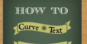
The letters didn’t seem to be curving as nicely (see how the “Cu” and the “Te” look too straight?), so I had to break them up even more. This gave me “c-u-rv-e” and “t-e-x-t.”
I also had to shift everything over to the right, since I had so much extra space over there. (If this happens to you, it means you will have to re-rotate all of your text boxes, since they won’t properly align with the banner directly below them anymore.)
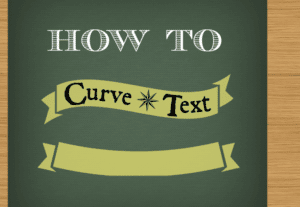
Ahhh! Much better!
The second method of placing text was a little easier. I broke up the word “Picmonkey” and created all of the text boxes at once.
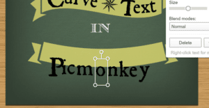
This gave me “P-ic-m-o-n-ke-y.” I learned that wider letters like “m” and “o” should get their own box, while thinner letters like “i” can be combined with others.
The letter “o” is in the exact middle of the word, so I started by putting it in the exact middle of the banner, then set the other letters on either side, rotating them to follow the line of the banner.
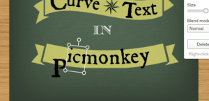
Because the middle letter is in the middle of the banner, I didn’t have to do any cleaning up to make it look right. Much easier. I vastly prefer this method.
Once the text is set in place, just add some neat graphics (I went with a “pirate/treasure map” sort of theme) and you’re done!
Some important points to remember for future reference:
- Break up your text into small pieces.
- Wider letters should be given their own box, while thinner letters can go in boxes with other letters.
- When in doubt (or for very steep curves), give each letter its own box. It will be more work, but it will also make for a cleaner finished product.
- Set the middle letter/text box in the middle of the banner first, then set the remaining text. It will automatically be centered.
- Rotate your text box so that the letters align with the curve of the banner directly beneath them.
This method of curving text may not be perfect or Photoshop simple, but it definitely works. Maybe one day Picmonkey will add a “curve text” feature to their website, but in the meantime, you can rest easy knowing that there is a way for you to use all of those neat curving banners. The world of design is your oyster! Err…treasure chest? Or…something pirate-y….
Of course, blog header images are only a small part of getting your blog out to the public. But these 5 Tips to Make Your Blog Look Beautiful will bring your blog to the next level.
Update: Thanks so much to @PicMonkeyApp for sharing our tutorial on their X feed! It means a lot to us.
Clarity Creative Group is a digital marketing & Orlando SEO company located in beautiful Orlando, Florida. We respect Johnny Depp for his successful use of guyliner in his role as Captain Jack Sparrow.
Save
Save
Save
Save


